
A quirk I ran across yesterday with CSS on a drop down list. The list is disabled and has a width fixed with CSS and is contained in a table cell. The selected option text is wider than the fixed width of the list.
<table class="grid_table_new">
  <tbody>
    <tr>
      <td><select style="width:130px;" disabled="disabled" >
          <option value="47" selected="selected">Traditur Preascep irruit. Sed now possum Non adamare te. Maneam</option>
        </select></td>
    </tr>
</table>
When viewed in the browser the list looks like as you would expect:

Except someone showed me their screen, and it looked different:
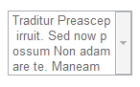
As you can see, the drop down has expanded vertically to display the entirety of the option text. I tested this page in a bunch of browsers and found this was only happening in a couple of browsers:
- Chrome (Win) – YES
- FF (Win) – no
- Safari (Win) – YES
- IE11 – no
- Chrome (Mac) – no
- FF (Mac) – no
- Safari (Mac) – no
After a significant amount of poking around in a large amount of CSS I finally tracked it down to this piece of CSS:
table.grid_table_new td, table.grid_table_new th {
	word-wrap: break-word;
}
word-wrap has been around for a while but from what I can tell is not officially applicable to options in a select list, it’s designed to help when formatting blocks of text on a page, and has now been renamed to overflow-wrap, which now seems to be supported by current browsers. I tried swapping the existing property to overflow-wrap – same outcomes though.
It seems this is a quirk of Chrome and Safari on Windows (note, NOT on Mac). And given it’s impossible to specific that my customers should use one of those browsers clearly we need an alternative solution to cope with these long text options. Thankfully JQuery gives us choices, such as this plugin.
Filed under: Programming Tagged: Chrome, CSS, HTML, Internet Explorer, Safari
